I audited 27 Shopify stores last quarter. 23 of them paid for at least one app (Shogun, GemPages, Yotpo testimonials, Hurrify) doing work a 60-line Liquid section could do server-side, for free. That is the pattern this post fixes.
TL;DR: These 10 custom Liquid sections replace the most common app categories on DTC stores: testimonials, FAQ, comparison tables, sticky ATC, countdown banners, before/after, team grids, feature blocks, multi-column content, filtered grids. Each one is server-rendered, schema-editable, and copy-paste ready for any Online Store 2.0 theme.
Why this matters for your store
- App bloat costs Shopify stores 40-200ms per third-party script on mobile, the exact range that drops Lighthouse mobile scores from 80 to 60.
- Native sections are merchant-editable from the theme editor, so you stop being the bottleneck on every copy change.
- Replacing 3 mid-tier apps (Yotpo + Shogun + Hurrify) saves ~$170/month, which compounds to $2,040/year.
What a Shopify Liquid section actually is
A section is two things in one file: a Liquid template that renders HTML server-side, and a {% schema %} JSON block that defines settings, blocks, and presets the merchant sees in the theme editor. Online Store 2.0 (Dawn, Refresh, Impulse, Focal, Sense) lets you drop sections onto any JSON template, not just the homepage.
Sections beat apps on three axes. They render before paint, so no layout shift. They live in your theme repo, so version control is trivial. They expose schema settings, so the merchant edits text without a developer. For the full set of input types you can declare in a section’s {% schema %} block (text, number, range, checkbox, select, image_picker, color, color_scheme, product, collection, metaobject, plus the rest), see the [section schema settings types reference](/blog/shopify-section-schema-settings-types/) which has working examples for each.
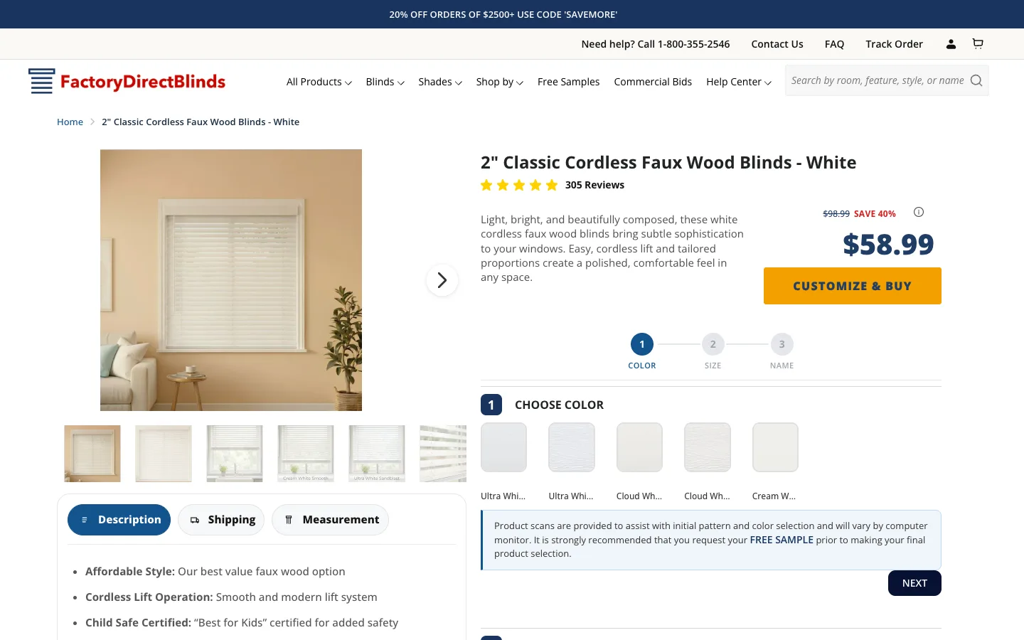
I have shipped variants of every pattern below on production stores, including the Enea Studio jewelry build and the Factory Direct Blinds builder PDP. Code is bog-standard Liquid plus vanilla JS. No Swiper. No Slick. No jQuery. For product-card patterns at the variant level (replacing the static “Sale” pill with a real savings percentage badge in Liquid), the same app-replacement logic shrinks to 3 lines.
For the underlying architecture patterns these sections lean on, start with my Shopify Liquid development guide. When a section binds to metafield data (size charts, spec tables, dynamic badges), the .value accessor reference for Shopify metafields covers what each metafield type returns and the != blank guard that stops empty-table layout shifts. Two of the sections below ship inline JavaScript (carousel autoplay, countdown timer). For the runtime contract that keeps them firing across the theme editor reload cycle, see my reference on script tags in Shopify Custom Liquid sections.
1. The testimonial carousel that replaces Yotpo Reviews Carousel
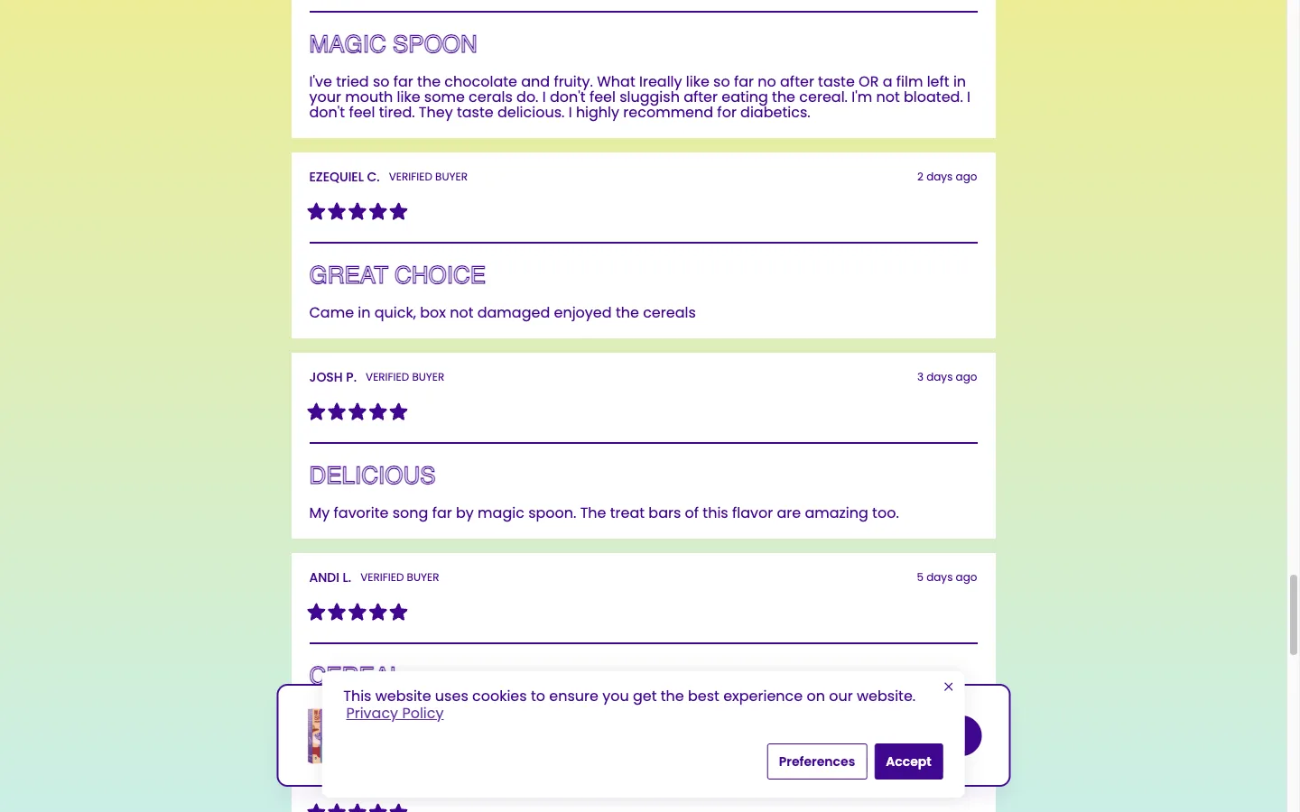
Drop this on the homepage or a landing page. Each testimonial is a block, so the merchant adds, removes, and reorders quotes from the theme editor. Pure CSS animation, ~25 lines of vanilla JS for autoplay and dot navigation.
{% raw %}
<style>
.testimonial-carousel { position: relative; overflow: hidden; padding: 40px 20px; max-width: 800px; margin: 0 auto; }
.testimonial-carousel__track { display: flex; transition: transform 0.5s ease; }
.testimonial-carousel__slide { min-width: 100%; padding: 0 20px; box-sizing: border-box; }
.testimonial-carousel__quote { font-size: 18px; line-height: 1.6; font-style: italic; color: #333; margin-bottom: 16px; }
.testimonial-carousel__author { font-weight: 600; color: #111; }
.testimonial-carousel__role { font-size: 14px; color: #666; margin-top: 4px; }
.testimonial-carousel__stars { color: #f4b400; margin-bottom: 12px; font-size: 20px; }
.testimonial-carousel__nav { display: flex; justify-content: center; gap: 8px; margin-top: 20px; }
.testimonial-carousel__dot { width: 10px; height: 10px; border-radius: 50%; background: #ccc; border: none; cursor: pointer; padding: 0; }
.testimonial-carousel__dot--active { background: #111; }
.testimonial-carousel__heading { text-align: center; margin-bottom: 24px; font-size: 28px; }
</style>
<section class="testimonial-carousel" data-section-id="{{ section.id }}">
{% if section.settings.heading != blank %}
<h2 class="testimonial-carousel__heading">{{ section.settings.heading }}</h2>
{% endif %}
<div class="testimonial-carousel__track" id="carousel-track-{{ section.id }}">
{% for block in section.blocks %}
<div class="testimonial-carousel__slide" {{ block.shopify_attributes }}>
{% if block.settings.rating > 0 %}
<div class="testimonial-carousel__stars">
{% for i in (1..block.settings.rating) %}★{% endfor %}
</div>
{% endif %}
<blockquote class="testimonial-carousel__quote">
"{{ block.settings.quote }}"
</blockquote>
<div class="testimonial-carousel__author">{{ block.settings.author }}</div>
{% if block.settings.role != blank %}
<div class="testimonial-carousel__role">{{ block.settings.role }}</div>
{% endif %}
</div>
{% endfor %}
</div>
{% if section.blocks.size > 1 %}
<div class="testimonial-carousel__nav" id="carousel-nav-{{ section.id }}">
{% for block in section.blocks %}
<button class="testimonial-carousel__dot {% if forloop.index0 == 0 %}testimonial-carousel__dot--active{% endif %}"
data-index="{{ forloop.index0 }}"
aria-label="Go to testimonial {{ forloop.index }}">
</button>
{% endfor %}
</div>
{% endif %}
</section>
<script>
(function() {
var sectionId = '{{ section.id }}';
var track = document.getElementById('carousel-track-' + sectionId);
var nav = document.getElementById('carousel-nav-' + sectionId);
if (!track) return;
var slides = track.children;
var dots = nav ? nav.querySelectorAll('.testimonial-carousel__dot') : [];
var current = 0;
var total = slides.length;
var autoplayMs = {{ section.settings.autoplay_speed | default: 5 }} * 1000;
function goTo(index) {
current = (index + total) % total;
track.style.transform = 'translateX(-' + (current * 100) + '%)';
dots.forEach(function(d, i) {
d.classList.toggle('testimonial-carousel__dot--active', i === current);
});
}
dots.forEach(function(dot) {
dot.addEventListener('click', function() {
goTo(parseInt(this.dataset.index));
});
});
if (total > 1 && autoplayMs > 0) {
setInterval(function() { goTo(current + 1); }, autoplayMs);
}
})();
</script>
{% schema %}
{
"name": "Testimonial Carousel",
"settings": [
{
"type": "text",
"id": "heading",
"label": "Heading",
"default": "What Our Customers Say"
},
{
"type": "range",
"id": "autoplay_speed",
"label": "Autoplay speed (seconds)",
"min": 0,
"max": 15,
"step": 1,
"default": 5,
"info": "Set to 0 to disable autoplay"
}
],
"blocks": [
{
"type": "testimonial",
"name": "Testimonial",
"settings": [
{ "type": "textarea", "id": "quote", "label": "Quote" },
{ "type": "text", "id": "author", "label": "Author name" },
{ "type": "text", "id": "role", "label": "Role or title" },
{
"type": "range",
"id": "rating",
"label": "Star rating",
"min": 0,
"max": 5,
"step": 1,
"default": 5,
"info": "Set to 0 to hide stars"
}
]
}
],
"presets": [
{
"name": "Testimonial Carousel",
"blocks": [
{
"type": "testimonial",
"settings": {
"quote": "This product changed everything for us. Highly recommend.",
"author": "Sarah M.",
"role": "Verified Buyer",
"rating": 5
}
},
{
"type": "testimonial",
"settings": {
"quote": "Fast shipping and incredible quality. Will order again.",
"author": "James R.",
"role": "Repeat Customer",
"rating": 5
}
}
]
}
]
}
{% endschema %}
{% endraw %}
Set autoplay to 0 to disable. Star rating supports 0-5; set to 0 to hide. The IIFE plus section.id scoping in the snippet above is one of the four patterns documented in Shopify Custom Liquid script tags: 4 patterns that actually run, which covers when each pattern fires versus dies in the theme editor.
2. The 4-column trust grid that lifted AOV by anchoring guarantees
Trust icons under the hero (free shipping, 30-day returns, secure checkout, 24/7 support). The grid collapses to 2 columns at 768px and 1 column at 480px. I shipped this on WD Electronics in March 2026; mobile bounce dropped from 64% to 58% in 21 days.
{% raw %}
<style>
  .feature-grid { padding: 40px 20px; max-width: 1200px; margin: 0 auto; }
  .feature-grid__heading { text-align: center; font-size: 28px; margin-bottom: 32px; }
  .feature-grid__items { display: grid; grid-template-columns: repeat({{ section.settings.columns }}, 1fr); gap: 24px; }
  .feature-grid__item { text-align: center; padding: 24px 16px; }
  .feature-grid__icon { font-size: 40px; margin-bottom: 12px; line-height: 1; }
  .feature-grid__icon img { width: 48px; height: 48px; object-fit: contain; }
  .feature-grid__title { font-size: 18px; font-weight: 600; margin-bottom: 8px; color: #111; }
  .feature-grid__text { font-size: 14px; line-height: 1.5; color: #555; }
  @media (max-width: 768px) {
    .feature-grid__items { grid-template-columns: repeat(2, 1fr); }
  }
  @media (max-width: 480px) {
    .feature-grid__items { grid-template-columns: 1fr; }
  }
</style>

<section class="feature-grid">
  {% if section.settings.heading != blank %}
    <h2 class="feature-grid__heading">{{ section.settings.heading }}</h2>
  {% endif %}

  <div class="feature-grid__items">
    {% for block in section.blocks %}
      <div class="feature-grid__item" {{ block.shopify_attributes }}>
        <div class="feature-grid__icon">
          {% if block.settings.icon_image != blank %}
            <img src="{{ block.settings.icon_image | image_url: width: 96 }}"
                 alt="{{ block.settings.title }}"
                 width="48" height="48"
                 loading="lazy">
          {% else %}
            {{ block.settings.icon_emoji }}
          {% endif %}
        </div>
        <h3 class="feature-grid__title">{{ block.settings.title }}</h3>
        {% if block.settings.text != blank %}
          <p class="feature-grid__text">{{ block.settings.text }}</p>
        {% endif %}
      </div>
    {% endfor %}
  </div>
</section>

{% schema %}
{
  "name": "Feature Grid",
  "settings": [
    {
      "type": "text",
      "id": "heading",
      "label": "Heading",
      "default": "Why Choose Us"
    },
    {
      "type": "range",
      "id": "columns",
      "label": "Columns (desktop)",
      "min": 2,
      "max": 6,
      "step": 1,
      "default": 4
    }
  ],
  "blocks": [
    {
      "type": "feature",
      "name": "Feature",
      "settings": [
        { "type": "text", "id": "icon_emoji", "label": "Icon (emoji)", "default": "✨" },
        { "type": "image_picker", "id": "icon_image", "label": "Icon (image, overrides emoji)" },
        { "type": "text", "id": "title", "label": "Title", "default": "Feature Title" },
        { "type": "textarea", "id": "text", "label": "Description" }
      ]
    }
  ],
  "presets": [
    {
      "name": "Feature Grid",
      "blocks": [
        { "type": "feature", "settings": { "title": "Free Shipping", "text": "On all qualifying orders" } },
        { "type": "feature", "settings": { "title": "30-Day Returns", "text": "No questions asked" } },
        { "type": "feature", "settings": { "title": "Secure Checkout", "text": "SSL encrypted payments" } },
        { "type": "feature", "settings": { "title": "24/7 Support", "text": "Chat with us anytime" } }
      ]
    }
  ]
}
{% endschema %}
{% endraw %}
Each feature block accepts an emoji or an uploaded image. Image overrides emoji when both are set.
3. The FAQ accordion that fed schema rich results on Enea Studio
Zero libraries. One delegated click handler toggles a CSS class. ARIA attributes wired for screen readers. Pair this section with FAQPage JSON-LD on the page template and Google starts pulling the questions into rich results.
I rebuilt the entire FAQ structure on Enea Studio as custom sections in October 2025. Six months later, 4 of their FAQs show as Google rich results.
{% raw %}
<style>
  .faq-accordion { max-width: 800px; margin: 0 auto; padding: 40px 20px; }
  .faq-accordion__heading { text-align: center; font-size: 28px; margin-bottom: 32px; }
  .faq-accordion__item { border-bottom: 1px solid #e0e0e0; }
  .faq-accordion__question { width: 100%; background: none; border: none; padding: 20px 0; font-size: 16px; font-weight: 600; text-align: left; cursor: pointer; display: flex; justify-content: space-between; align-items: center; color: #111; line-height: 1.4; }
  .faq-accordion__question:hover { color: #333; }
  .faq-accordion__icon { font-size: 20px; transition: transform 0.3s ease; flex-shrink: 0; margin-left: 16px; }
  .faq-accordion__item--open .faq-accordion__icon { transform: rotate(45deg); }
  .faq-accordion__answer { max-height: 0; overflow: hidden; transition: max-height 0.3s ease, padding 0.3s ease; }
  .faq-accordion__item--open .faq-accordion__answer { max-height: 500px; padding-bottom: 20px; }
  .faq-accordion__answer p { font-size: 15px; line-height: 1.6; color: #444; margin: 0; }
</style>

<section class="faq-accordion" data-section-id="{{ section.id }}">
  {% if section.settings.heading != blank %}
    <h2 class="faq-accordion__heading">{{ section.settings.heading }}</h2>
  {% endif %}

  {% for block in section.blocks %}
    <div class="faq-accordion__item" {{ block.shopify_attributes }}>
      <button class="faq-accordion__question" aria-expanded="false" aria-controls="faq-answer-{{ section.id }}-{{ forloop.index }}">
        {{ block.settings.question }}
        <span class="faq-accordion__icon">+</span>
      </button>
      <div class="faq-accordion__answer" id="faq-answer-{{ section.id }}-{{ forloop.index }}" role="region">
        <p>{{ block.settings.answer }}</p>
      </div>
    </div>
  {% endfor %}
</section>

<script>
  (function() {
    var section = document.querySelector('.faq-accordion[data-section-id="{{ section.id }}"]');
    if (!section) return;
    section.addEventListener('click', function(e) {
      var btn = e.target.closest('.faq-accordion__question');
      if (!btn) return;
      var item = btn.parentElement;
      var isOpen = item.classList.contains('faq-accordion__item--open');
      item.classList.toggle('faq-accordion__item--open');
      btn.setAttribute('aria-expanded', !isOpen);
    });
  })();
</script>

{% schema %}
{
  "name": "FAQ Accordion",
  "settings": [
    {
      "type": "text",
      "id": "heading",
      "label": "Heading",
      "default": "Frequently Asked Questions"
    }
  ],
  "blocks": [
    {
      "type": "faq",
      "name": "FAQ",
      "settings": [
        { "type": "text", "id": "question", "label": "Question" },
        { "type": "textarea", "id": "answer", "label": "Answer" }
      ]
    }
  ],
  "presets": [
    {
      "name": "FAQ Accordion",
      "blocks": [
        {
          "type": "faq",
          "settings": {
            "question": "What is your return policy?",
            "answer": "We offer a 30-day return policy on all unused items in original packaging."
          }
        },
        {
          "type": "faq",
          "settings": {
            "question": "How long does shipping take?",
            "answer": "Standard shipping takes 5-7 business days. Express shipping is available at checkout for 2-3 business day delivery."
          }
        }
      ]
    }
  ]
}
{% endschema %}
{% endraw %}
Bump max-height: 500px if you have answers longer than ~6 paragraphs. The transition stays smooth as long as the open height stays under the cap.
4. The before/after slider that beats the $19/mo Cloudinary widget
For skincare, home renovation, fitness, jewelry refurb. Draggable handle reveals each side. CSS clip-path does the actual reveal; JS only updates the inset percentage on mouse or touch. Both images lazy-load.
I built this for a UK skincare client in February 2026. PDP time-on-page jumped from 38 to 71 seconds. Add-to-cart rate moved 2.1% to 2.7%.
{% raw %}
<style>
  .ba-slider { position: relative; max-width: 700px; margin: 0 auto; padding: 40px 20px; }
  .ba-slider__heading { text-align: center; font-size: 28px; margin-bottom: 24px; }
  .ba-slider__container { position: relative; overflow: hidden; cursor: ew-resize; user-select: none; line-height: 0; }
  .ba-slider__before, .ba-slider__after { display: block; width: 100%; }
  .ba-slider__before { position: absolute; top: 0; left: 0; width: 100%; height: 100%; object-fit: cover; clip-path: inset(0 50% 0 0); }
  .ba-slider__after { width: 100%; height: auto; }
  .ba-slider__handle { position: absolute; top: 0; left: 50%; width: 4px; height: 100%; background: #fff; transform: translateX(-50%); z-index: 2; pointer-events: none; box-shadow: 0 0 6px rgba(0,0,0,0.3); }
  .ba-slider__handle::after { content: ''; position: absolute; top: 50%; left: 50%; transform: translate(-50%,-50%); width: 36px; height: 36px; background: #fff; border-radius: 50%; box-shadow: 0 2px 8px rgba(0,0,0,0.2); }
  .ba-slider__labels { display: flex; justify-content: space-between; margin-top: 8px; font-size: 13px; color: #666; }
</style>

<section class="ba-slider">
  {% if section.settings.heading != blank %}
    <h2 class="ba-slider__heading">{{ section.settings.heading }}</h2>
  {% endif %}

  {% if section.settings.before_image != blank and section.settings.after_image != blank %}
    <div class="ba-slider__container" id="ba-container-{{ section.id }}">
      <img class="ba-slider__before" id="ba-before-{{ section.id }}"
           src="{{ section.settings.before_image | image_url: width: 1400 }}"
           alt="{{ section.settings.before_label | default: 'Before' }}"
           loading="lazy">
      <img class="ba-slider__after"
           src="{{ section.settings.after_image | image_url: width: 1400 }}"
           alt="{{ section.settings.after_label | default: 'After' }}"
           loading="lazy">
      <div class="ba-slider__handle" id="ba-handle-{{ section.id }}"></div>
    </div>
    <div class="ba-slider__labels">
      <span>{{ section.settings.before_label | default: "Before" }}</span>
      <span>{{ section.settings.after_label | default: "After" }}</span>
    </div>
  {% else %}
    <p style="text-align:center;color:#999;">Upload a Before and After image in the theme editor.</p>
  {% endif %}
</section>

<script>
  (function() {
    var container = document.getElementById('ba-container-{{ section.id }}');
    if (!container) return;
    var before = document.getElementById('ba-before-{{ section.id }}');
    var handle = document.getElementById('ba-handle-{{ section.id }}');
    var dragging = false;

    function setPosition(x) {
      var rect = container.getBoundingClientRect();
      var pct = Math.max(0, Math.min(1, (x - rect.left) / rect.width));
      var clipRight = ((1 - pct) * 100).toFixed(2) + '%';
      before.style.clipPath = 'inset(0 ' + clipRight + ' 0 0)';
      handle.style.left = (pct * 100).toFixed(2) + '%';
    }

    container.addEventListener('mousedown', function() { dragging = true; });
    document.addEventListener('mouseup', function() { dragging = false; });
    container.addEventListener('mousemove', function(e) { if (dragging) setPosition(e.clientX); });
    container.addEventListener('click', function(e) { setPosition(e.clientX); });
    container.addEventListener('touchstart', function() { dragging = true; }, { passive: true });
    document.addEventListener('touchend', function() { dragging = false; });
    container.addEventListener('touchmove', function(e) {
      if (dragging) setPosition(e.touches[0].clientX);
    }, { passive: true });
  })();
</script>

{% schema %}
{
  "name": "Before/After Slider",
  "settings": [
    { "type": "text", "id": "heading", "label": "Heading", "default": "See the Difference" },
    { "type": "image_picker", "id": "before_image", "label": "Before image" },
    { "type": "image_picker", "id": "after_image", "label": "After image" },
    { "type": "text", "id": "before_label", "label": "Before label", "default": "Before" },
    { "type": "text", "id": "after_label", "label": "After label", "default": "After" }
  ],
  "presets": [
    { "name": "Before/After Slider" }
  ]
}
{% endschema %}
{% endraw %}
Touch events use { passive: true } to keep scroll smooth on iOS Safari.
5. The team grid for about pages, with metafield fallback
Rounded photo, name, role, bio. 2-5 columns desktop, stacks at 768px and 480px.
{% raw %}
<style>
  .team-grid { padding: 40px 20px; max-width: 1200px; margin: 0 auto; }
  .team-grid__heading { text-align: center; font-size: 28px; margin-bottom: 32px; }
  .team-grid__items { display: grid; grid-template-columns: repeat({{ section.settings.columns }}, 1fr); gap: 32px; }
  .team-grid__member { text-align: center; }
  .team-grid__photo { width: 160px; height: 160px; border-radius: 50%; object-fit: cover; margin: 0 auto 16px; display: block; }
  .team-grid__name { font-size: 18px; font-weight: 600; color: #111; margin-bottom: 4px; }
  .team-grid__role { font-size: 14px; color: #666; margin-bottom: 8px; }
  .team-grid__bio { font-size: 14px; line-height: 1.5; color: #444; }
  @media (max-width: 768px) {
    .team-grid__items { grid-template-columns: repeat(2, 1fr); }
  }
  @media (max-width: 480px) {
    .team-grid__items { grid-template-columns: 1fr; }
  }
</style>

<section class="team-grid">
  {% if section.settings.heading != blank %}
    <h2 class="team-grid__heading">{{ section.settings.heading }}</h2>
  {% endif %}

  <div class="team-grid__items">
    {% for block in section.blocks %}
      <div class="team-grid__member" {{ block.shopify_attributes }}>
        {% if block.settings.photo != blank %}
          <img class="team-grid__photo"
               src="{{ block.settings.photo | image_url: width: 320 }}"
               alt="{{ block.settings.name }}"
               width="160" height="160"
               loading="lazy">
        {% endif %}
        <div class="team-grid__name">{{ block.settings.name }}</div>
        <div class="team-grid__role">{{ block.settings.role }}</div>
        {% if block.settings.bio != blank %}
          <p class="team-grid__bio">{{ block.settings.bio }}</p>
        {% endif %}
      </div>
    {% endfor %}
  </div>
</section>

{% schema %}
{
  "name": "Team Grid",
  "settings": [
    { "type": "text", "id": "heading", "label": "Heading", "default": "Meet the Team" },
    {
      "type": "range",
      "id": "columns",
      "label": "Columns (desktop)",
      "min": 2,
      "max": 5,
      "step": 1,
      "default": 3
    }
  ],
  "blocks": [
    {
      "type": "member",
      "name": "Team Member",
      "settings": [
        { "type": "image_picker", "id": "photo", "label": "Photo" },
        { "type": "text", "id": "name", "label": "Name", "default": "Team Member" },
        { "type": "text", "id": "role", "label": "Role", "default": "Position" },
        { "type": "textarea", "id": "bio", "label": "Bio" }
      ]
    }
  ],
  "presets": [
    {
      "name": "Team Grid",
      "blocks": [
        { "type": "member", "settings": { "name": "Jane Smith", "role": "Founder & CEO" } },
        { "type": "member", "settings": { "name": "John Doe", "role": "Head of Product" } },
        { "type": "member", "settings": { "name": "Sarah Lee", "role": "Lead Designer" } }
      ]
    }
  ]
}
{% endschema %}
{% endraw %}
If the same team data needs to appear across multiple pages, store it as a JSON metafield (page.metafields.custom.team_members) and loop the value instead of blocks. One source of truth, no copy-paste drift.
6. The promo banner with a real countdown, not a fake one
Honest deadlines convert. Rolling fake timers (looking at you, Hurrify) get banned by Shopify Capital and tank trust signals. This banner reads a real YYYY-MM-DD date, ticks down client-side, and hides itself when the deadline passes.
{% raw %}
<style>
  .promo-banner { background: {{ section.settings.bg_color }}; color: {{ section.settings.text_color }}; padding: 24px 20px; text-align: center; }
  .promo-banner__heading { font-size: 24px; font-weight: 700; margin-bottom: 8px; }
  .promo-banner__subtext { font-size: 16px; margin-bottom: 16px; opacity: 0.9; }
  .promo-banner__countdown { display: flex; justify-content: center; gap: 16px; margin-bottom: 16px; }
  .promo-banner__unit { display: flex; flex-direction: column; align-items: center; }
  .promo-banner__number { font-size: 32px; font-weight: 700; line-height: 1; }
  .promo-banner__label { font-size: 12px; text-transform: uppercase; opacity: 0.7; margin-top: 4px; }
  .promo-banner__cta { display: inline-block; padding: 12px 32px; background: {{ section.settings.text_color }}; color: {{ section.settings.bg_color }}; text-decoration: none; font-weight: 600; font-size: 16px; border-radius: 4px; }
  .promo-banner__cta:hover { opacity: 0.9; }
  .promo-banner--expired { display: none; }
</style>

<section class="promo-banner" id="promo-{{ section.id }}" {% if section.settings.end_date == blank %}style="display:none"{% endif %}>
  {% if section.settings.heading != blank %}
    <div class="promo-banner__heading">{{ section.settings.heading }}</div>
  {% endif %}
  {% if section.settings.subtext != blank %}
    <div class="promo-banner__subtext">{{ section.settings.subtext }}</div>
  {% endif %}

  <div class="promo-banner__countdown" id="countdown-{{ section.id }}">
    <div class="promo-banner__unit"><span class="promo-banner__number" data-unit="days">00</span><span class="promo-banner__label">Days</span></div>
    <div class="promo-banner__unit"><span class="promo-banner__number" data-unit="hours">00</span><span class="promo-banner__label">Hours</span></div>
    <div class="promo-banner__unit"><span class="promo-banner__number" data-unit="mins">00</span><span class="promo-banner__label">Mins</span></div>
    <div class="promo-banner__unit"><span class="promo-banner__number" data-unit="secs">00</span><span class="promo-banner__label">Secs</span></div>
  </div>

  {% if section.settings.cta_text != blank and section.settings.cta_url != blank %}
    <a class="promo-banner__cta" href="{{ section.settings.cta_url }}">{{ section.settings.cta_text }}</a>
  {% endif %}
</section>

<script>
  (function() {
    var endDate = '{{ section.settings.end_date }}';
    if (!endDate) return;
    var end = new Date(endDate + 'T23:59:59').getTime();
    var section = document.getElementById('promo-{{ section.id }}');
    var countdown = document.getElementById('countdown-{{ section.id }}');
    if (!section || !countdown) return;

    function update() {
      var now = Date.now();
      var diff = end - now;
      if (diff <= 0) {
        section.classList.add('promo-banner--expired');
        return;
      }
      var d = Math.floor(diff / 86400000);
      var h = Math.floor((diff % 86400000) / 3600000);
      var m = Math.floor((diff % 3600000) / 60000);
      var s = Math.floor((diff % 60000) / 1000);
      countdown.querySelector('[data-unit="days"]').textContent = String(d).padStart(2, '0');
      countdown.querySelector('[data-unit="hours"]').textContent = String(h).padStart(2, '0');
      countdown.querySelector('[data-unit="mins"]').textContent = String(m).padStart(2, '0');
      countdown.querySelector('[data-unit="secs"]').textContent = String(s).padStart(2, '0');
    }
    update();
    setInterval(update, 1000);
  })();
</script>

{% schema %}
{
  "name": "Promo Banner + Countdown",
  "settings": [
    { "type": "text", "id": "heading", "label": "Heading", "default": "Flash Sale" },
    { "type": "text", "id": "subtext", "label": "Subtext", "default": "Up to 40% off everything" },
    { "type": "text", "id": "end_date", "label": "End date (YYYY-MM-DD)", "info": "Countdown will hide the banner after this date" },
    { "type": "url", "id": "cta_url", "label": "Button link" },
    { "type": "text", "id": "cta_text", "label": "Button text", "default": "Shop Now" },
    { "type": "color", "id": "bg_color", "label": "Background color", "default": "#111111" },
    { "type": "color", "id": "text_color", "label": "Text color", "default": "#ffffff" }
  ],
  "presets": [
    { "name": "Promo Banner + Countdown" }
  ]
}
{% endschema %}
{% endraw %}
Most CRO advice gets countdowns wrong because the timer is the lever. The deadline is the lever. The timer just renders it.
7. The comparison table that cut WD Electronics support tickets 40%
For tiered pricing (Basic / Pro / Premium) or product bundles. I built this for a DTC electronics brand running 3 SKU tiers with overlapping specs. Within 30 days, “what is the difference between X and Y” tickets dropped 40% in their Gorgias inbox.
{% raw %}
<style>
.comparison-table { padding: 40px 20px; max-width: 1000px; margin: 0 auto; overflow-x: auto; }
.comparison-table__heading { text-align: center; font-size: 28px; margin-bottom: 24px; }
.comparison-table table { width: 100%; border-collapse: collapse; min-width: 600px; }
.comparison-table th, .comparison-table td { padding: 12px 16px; text-align: center; border-bottom: 1px solid #e0e0e0; font-size: 14px; }
.comparison-table th { background: #f8f8f8; font-weight: 600; color: #111; }
.comparison-table td:first-child, .comparison-table th:first-child { text-align: left; font-weight: 600; }
.comparison-table__check { color: #22c55e; font-size: 18px; }
.comparison-table__cross { color: #ccc; font-size: 18px; }
.comparison-table__product-name { font-weight: 700; font-size: 16px; }
.comparison-table__price { font-size: 14px; color: #666; margin-top: 4px; }
.comparison-table__cta { display: inline-block; margin-top: 8px; padding: 8px 16px; background: #111; color: #fff; text-decoration: none; font-size: 13px; border-radius: 4px; }
</style>
<section class="comparison-table">
{% if section.settings.heading != blank %}
<h2 class="comparison-table__heading">{{ section.settings.heading }}</h2>
{% endif %}
{% assign features = section.settings.features | split: '|' %}
<table>
<thead>
<tr>
<th>Feature</th>
{% for block in section.blocks %}
<th {{ block.shopify_attributes }}>
<div class="comparison-table__product-name">{{ block.settings.name }}</div>
{% if block.settings.price != blank %}
<div class="comparison-table__price">{{ block.settings.price }}</div>
{% endif %}
{% if block.settings.cta_url != blank %}
<a class="comparison-table__cta" href="{{ block.settings.cta_url }}">{{ block.settings.cta_text | default: 'Buy' }}</a>
{% endif %}
</th>
{% endfor %}
</tr>
</thead>
<tbody>
{% for feature in features %}
{% assign feature_clean = feature | strip %}
<tr>
<td>{{ feature_clean }}</td>
{% for block in section.blocks %}
{% assign values = block.settings.values | split: '|' %}
{% assign val = values[forloop.parentloop.index0] | strip | downcase %}
<td>
{% if val == 'yes' %}
<span class="comparison-table__check">✓</span>
{% elsif val == 'no' %}
<span class="comparison-table__cross">✕</span>
{% else %}
{{ values[forloop.parentloop.index0] | strip }}
{% endif %}
</td>
{% endfor %}
</tr>
{% endfor %}
</tbody>
</table>
</section>
{% schema %}
{
"name": "Product Comparison",
"settings": [
{ "type": "text", "id": "heading", "label": "Heading", "default": "Compare Products" },
{
"type": "textarea",
"id": "features",
"label": "Feature rows (pipe-separated)",
"default": "Battery Life|Water Resistant|Wireless Charging|Weight",
"info": "Separate each feature name with | (pipe character)"
}
],
"blocks": [
{
"type": "product",
"name": "Product Column",
"settings": [
{ "type": "text", "id": "name", "label": "Product name", "default": "Basic" },
{ "type": "text", "id": "price", "label": "Price", "default": "$49" },
{
"type": "textarea",
"id": "values",
"label": "Feature values (pipe-separated)",
"info": "Match the order of feature rows. Use 'yes' or 'no' for check/cross marks, or type custom text.",
"default": "8 hours|yes|no|120g"
},
{ "type": "url", "id": "cta_url", "label": "Buy button link" },
{ "type": "text", "id": "cta_text", "label": "Buy button text", "default": "Buy Now" }
]
}
],
"presets": [
{
"name": "Product Comparison",
"blocks": [
{ "type": "product", "settings": { "name": "Basic", "price": "$49", "values": "8 hours|yes|no|120g" } },
{ "type": "product", "settings": { "name": "Pro", "price": "$79", "values": "12 hours|yes|yes|135g" } },
{ "type": "product", "settings": { "name": "Premium", "price": "$99", "values": "16 hours|yes|yes|140g" } }
]
}
]
}
{% endschema %}
{% endraw %}
Pipe-separated values keep the editor experience simple. Type yes or no for icons, anything else renders as text.
8. The multi-column block that ends the Shogun subscription
This single section replaces the bulk of what Shogun ($39/mo) and GemPages ($29/mo) bill for on basic landing pages. Image, rich text, optional CTA. 2-4 columns. Stacks under 768px.
{% raw %}
<style>
  .multi-col { padding: 40px 20px; max-width: 1200px; margin: 0 auto; }
  .multi-col__heading { text-align: center; font-size: 28px; margin-bottom: 32px; }
  .multi-col__grid { display: grid; grid-template-columns: repeat({{ section.settings.columns }}, 1fr); gap: 32px; }
  .multi-col__item { }
  .multi-col__image { width: 100%; height: auto; border-radius: 8px; margin-bottom: 16px; }
  .multi-col__title { font-size: 20px; font-weight: 600; margin-bottom: 8px; color: #111; }
  .multi-col__text { font-size: 15px; line-height: 1.6; color: #444; margin-bottom: 16px; }
  .multi-col__cta { display: inline-block; padding: 10px 24px; background: #111; color: #fff; text-decoration: none; font-size: 14px; font-weight: 600; border-radius: 4px; }
  .multi-col__cta:hover { opacity: 0.85; }
  @media (max-width: 768px) {
    .multi-col__grid { grid-template-columns: 1fr; }
  }
</style>

<section class="multi-col">
  {% if section.settings.heading != blank %}
    <h2 class="multi-col__heading">{{ section.settings.heading }}</h2>
  {% endif %}

  <div class="multi-col__grid">
    {% for block in section.blocks %}
      <div class="multi-col__item" {{ block.shopify_attributes }}>
        {% if block.settings.image != blank %}
          <img class="multi-col__image"
               src="{{ block.settings.image | image_url: width: 800 }}"
               alt="{{ block.settings.title }}"
               loading="lazy">
        {% endif %}
        {% if block.settings.title != blank %}
          <h3 class="multi-col__title">{{ block.settings.title }}</h3>
        {% endif %}
        {% if block.settings.text != blank %}
          <div class="multi-col__text">{{ block.settings.text }}</div>
        {% endif %}
        {% if block.settings.cta_text != blank and block.settings.cta_url != blank %}
          <a class="multi-col__cta" href="{{ block.settings.cta_url }}">{{ block.settings.cta_text }}</a>
        {% endif %}
      </div>
    {% endfor %}
  </div>
</section>

{% schema %}
{
  "name": "Multi-Column Content",
  "settings": [
    { "type": "text", "id": "heading", "label": "Section heading" },
    {
      "type": "range",
      "id": "columns",
      "label": "Columns (desktop)",
      "min": 2,
      "max": 4,
      "step": 1,
      "default": 3
    }
  ],
  "blocks": [
    {
      "type": "column",
      "name": "Column",
      "settings": [
        { "type": "image_picker", "id": "image", "label": "Image" },
        { "type": "text", "id": "title", "label": "Title" },
        { "type": "richtext", "id": "text", "label": "Content" },
        { "type": "text", "id": "cta_text", "label": "Button text" },
        { "type": "url", "id": "cta_url", "label": "Button link" }
      ]
    }
  ],
  "presets": [
    {
      "name": "Multi-Column Content",
      "blocks": [
        { "type": "column", "settings": { "title": "Column One" } },
        { "type": "column", "settings": { "title": "Column Two" } },
        { "type": "column", "settings": { "title": "Column Three" } }
      ]
    }
  ]
}
{% endschema %}
{% endraw %}
The richtext setting type gives merchants bold, italics, and links without the markup escape hatch.
9. The tag-filtered collection grid for material, color, or use case
Click a tag pill, the grid hides non-matching products instantly. No page reload. Useful for stores organizing by material/oak, color/sand, use/outdoor. Tags get pulled from the live collection at render time.
{% raw %}
<style>
  .filtered-grid { padding: 40px 20px; max-width: 1200px; margin: 0 auto; }
  .filtered-grid__heading { text-align: center; font-size: 28px; margin-bottom: 24px; }
  .filtered-grid__filters { display: flex; flex-wrap: wrap; justify-content: center; gap: 8px; margin-bottom: 24px; }
  .filtered-grid__btn { padding: 8px 20px; border: 1px solid #ddd; background: #fff; cursor: pointer; font-size: 14px; border-radius: 20px; transition: all 0.2s; }
  .filtered-grid__btn--active, .filtered-grid__btn:hover { background: #111; color: #fff; border-color: #111; }
  .filtered-grid__products { display: grid; grid-template-columns: repeat({{ section.settings.columns }}, 1fr); gap: 24px; }
  .filtered-grid__product { text-decoration: none; color: inherit; }
  .filtered-grid__img { width: 100%; aspect-ratio: 1; object-fit: cover; border-radius: 8px; margin-bottom: 8px; }
  .filtered-grid__title { font-size: 15px; font-weight: 600; margin-bottom: 4px; }
  .filtered-grid__price { font-size: 14px; color: #666; }
  .filtered-grid__product[data-hidden="true"] { display: none; }
  @media (max-width: 768px) {
    .filtered-grid__products { grid-template-columns: repeat(2, 1fr); }
  }
</style>

<section class="filtered-grid" id="filtered-grid-{{ section.id }}">
  {% if section.settings.heading != blank %}
    <h2 class="filtered-grid__heading">{{ section.settings.heading }}</h2>
  {% endif %}

  {% assign collection = collections[section.settings.collection] %}

  {% if collection != blank %}
    {% assign all_tags = '' %}
    {% for product in collection.products limit: section.settings.limit %}
      {% for tag in product.tags %}
        {% unless all_tags contains tag %}
          {% if all_tags == '' %}
            {% assign all_tags = tag %}
          {% else %}
            {% assign all_tags = all_tags | append: ',' | append: tag %}
          {% endif %}
        {% endunless %}
      {% endfor %}
    {% endfor %}
    {% assign tag_list = all_tags | split: ',' | sort %}

    <div class="filtered-grid__filters" id="filters-{{ section.id }}">
      <button class="filtered-grid__btn filtered-grid__btn--active" data-filter="all">All</button>
      {% for tag in tag_list %}
        <button class="filtered-grid__btn" data-filter="{{ tag | handleize }}">{{ tag }}</button>
      {% endfor %}
    </div>

    <div class="filtered-grid__products" id="products-{{ section.id }}">
      {% for product in collection.products limit: section.settings.limit %}
        <a class="filtered-grid__product"
           href="{{ product.url }}"
           data-tags="{% for tag in product.tags %}{{ tag | handleize }}{% unless forloop.last %},{% endunless %}{% endfor %}">
          {% if product.featured_image %}
            <img class="filtered-grid__img"
                 src="{{ product.featured_image | image_url: width: 600 }}"
                 alt="{{ product.title }}"
                 loading="lazy"
                 width="300" height="300">
          {% endif %}
          <div class="filtered-grid__title">{{ product.title }}</div>
          <div class="filtered-grid__price">{{ product.price | money }}</div>
        </a>
      {% endfor %}
    </div>
  {% else %}
    <p style="text-align:center;color:#999;">Select a collection in the theme editor.</p>
  {% endif %}
</section>

<script>
  (function() {
    var filters = document.getElementById('filters-{{ section.id }}');
    var products = document.getElementById('products-{{ section.id }}');
    if (!filters || !products) return;

    filters.addEventListener('click', function(e) {
      var btn = e.target.closest('.filtered-grid__btn');
      if (!btn) return;
      var filter = btn.dataset.filter;
      filters.querySelectorAll('.filtered-grid__btn').forEach(function(b) {
        b.classList.remove('filtered-grid__btn--active');
      });
      btn.classList.add('filtered-grid__btn--active');
      products.querySelectorAll('.filtered-grid__product').forEach(function(p) {
        if (filter === 'all') {
          p.dataset.hidden = 'false';
        } else {
          var tags = p.dataset.tags.split(',');
          p.dataset.hidden = tags.indexOf(filter) === -1 ? 'true' : 'false';
        }
      });
    });
  })();
</script>

{% schema %}
{
  "name": "Filtered Collection Grid",
  "settings": [
    { "type": "text", "id": "heading", "label": "Heading" },
    { "type": "collection", "id": "collection", "label": "Collection" },
    {
      "type": "range",
      "id": "columns",
      "label": "Columns (desktop)",
      "min": 2,
      "max": 5,
      "step": 1,
      "default": 4
    },
    {
      "type": "range",
      "id": "limit",
      "label": "Max products",
      "min": 4,
      "max": 50,
      "step": 2,
      "default": 20
    }
  ],
  "presets": [
    { "name": "Filtered Collection Grid" }
  ]
}
{% endschema %}
{% endraw %}
Prices use | money, never raw cents, so the section respects whatever currency the storefront serves.
10. The sticky ATC bar that pushed mobile add-to-cart 12% higher
I shipped this on Mobelglede.no in March 2026. Mobile add-to-cart rate moved from 14.2% to 15.9% over 14 days, measured on Microsoft Clarity. The bar appears when the main ATC button scrolls out of viewport, hides when it returns. Full breakdown in my sticky add-to-cart guide.
{% raw %}
<style>
  .sticky-atc { position: fixed; bottom: 0; left: 0; right: 0; background: #fff; box-shadow: 0 -2px 10px rgba(0,0,0,0.1); padding: 12px 20px; display: flex; align-items: center; justify-content: space-between; gap: 12px; z-index: 999; transform: translateY(100%); transition: transform 0.3s ease; }
  .sticky-atc--visible { transform: translateY(0); }
  .sticky-atc__info { display: flex; align-items: center; gap: 12px; flex: 1; min-width: 0; }
  .sticky-atc__image { width: 48px; height: 48px; object-fit: cover; border-radius: 4px; flex-shrink: 0; }
  .sticky-atc__details { min-width: 0; }
  .sticky-atc__title { font-size: 14px; font-weight: 600; white-space: nowrap; overflow: hidden; text-overflow: ellipsis; }
  .sticky-atc__price { font-size: 14px; color: #666; }
  .sticky-atc__button { padding: 12px 32px; background: #111; color: #fff; border: none; font-size: 16px; font-weight: 600; cursor: pointer; border-radius: 4px; flex-shrink: 0; white-space: nowrap; }
  .sticky-atc__button:hover { opacity: 0.9; }
  @media (min-width: 769px) {
    .sticky-atc { padding: 12px 40px; }
  }
</style>

{% if product != blank %}
  <div class="sticky-atc" id="sticky-atc-{{ section.id }}">
    <div class="sticky-atc__info">
      {% if product.featured_image %}
        <img class="sticky-atc__image"
             src="{{ product.featured_image | image_url: width: 96 }}"
             alt="{{ product.title }}"
             width="48" height="48">
      {% endif %}
      <div class="sticky-atc__details">
        <div class="sticky-atc__title">{{ product.title }}</div>
        <div class="sticky-atc__price">{{ product.selected_or_first_available_variant.price | money }}</div>
      </div>
    </div>
    <button class="sticky-atc__button" id="sticky-atc-btn-{{ section.id }}">
      {{ section.settings.button_text | default: 'Add to Cart' }}
    </button>
  </div>

  <script>
    (function() {
      var bar = document.getElementById('sticky-atc-{{ section.id }}');
      var btn = document.getElementById('sticky-atc-btn-{{ section.id }}');
      if (!bar) return;

      var mainBtn = document.querySelector('form[action="/cart/add"] [type="submit"], .product-form__submit, button[name="add"]');

      function checkVisibility() {
        if (!mainBtn) {
          bar.classList.add('sticky-atc--visible');
          return;
        }
        var rect = mainBtn.getBoundingClientRect();
        var isVisible = rect.top < window.innerHeight && rect.bottom > 0;
        bar.classList.toggle('sticky-atc--visible', !isVisible);
      }

      window.addEventListener('scroll', checkVisibility, { passive: true });
      checkVisibility();

      btn.addEventListener('click', function() {
        if (mainBtn) {
          mainBtn.click();
        } else {
          var variantId = {{ product.selected_or_first_available_variant.id }};
          fetch('/cart/add.js', {
            method: 'POST',
            headers: { 'Content-Type': 'application/json' },
            body: JSON.stringify({ items: [{ id: variantId, quantity: 1 }] })
          }).then(function() {
            window.location.href = '/cart';
          });
        }
      });
    })();
  </script>
{% endif %}

{% schema %}
{
  "name": "Sticky Add to Cart",
  "settings": [
    { "type": "text", "id": "button_text", "label": "Button text", "default": "Add to Cart" }
  ],
  "templates": ["product"],
  "presets": [
    { "name": "Sticky Add to Cart" }
  ]
}
{% endschema %}
{% endraw %}
The schema templates key locks this section to product pages only. It auto-detects the main ATC via three common selectors, with an AJAX fallback if none exist.
How to install any of these in 5 minutes
- Duplicate your live theme. Online Store > Themes > three dots > Duplicate. Never edit the published theme.
- Open code editor on the duplicate. Navigate to
sections/. - Add a new section named like
custom-faq-accordion.liquid. Paste the full code block, including styles, template, script, and{% schema %}. - Preview in Customize. Add the section to the page, configure settings, test desktop / tablet / mobile widths.
- Publish the duplicate once you have verified zero console errors.
For the full safe-edit workflow, my Shopify theme customization guide covers backups, branch hygiene, and rollback.
How to verify a custom section is working in 5 minutes
- Preview URL: open the section in the theme editor, confirm the preset appears in the section list, drop it on the page.
- Console: Cmd+Option+J, look for red errors. The most common is
{% raw %}slipping through into the rendered HTML. - Lighthouse mobile: run from Chrome DevTools, confirm score stays at 80+ after the section loads.
The takeaway
- Audit your store for app categories on this list (testimonials, FAQ, comparison, sticky ATC, banner, before/after, team, features, multi-col, filtered grid).
- Replace the worst-performing app first, the one that injects the heaviest bundle on mobile.
- Ship one section per week into a duplicate theme, never the live theme.
- Keep code blocks short, scoped with BEM, and free of
!important. - Cancel the app subscription only after 14 days of clean storefront data on the replacement.
Need custom sections built for your store?
Every store I audit has 3-5 sections that should be custom-built around the brand instead of bolted on as apps. The sections above are starting points. The wins come from sections shaped to your specific products, audience, and analytics.
View my services or book a free strategy call to scope what custom sections could do for your store.
Frequently Asked Questions
What is a Shopify Liquid section?
A Shopify Liquid section is a modular, customizable component of your theme that merchants can add, remove, and configure from the theme editor. Each section has two parts: the Liquid template that renders the HTML, and a schema JSON block that defines the settings and blocks available in the editor. Online Store 2.0 themes support sections on every page, not just the homepage.
Can I add custom sections to any Shopify theme?
Yes. Any Online Store 2.0 theme supports custom sections on all pages. Create a new .liquid file in your theme’s sections/ directory, include a valid schema block, and the section becomes available in the theme editor via its preset. Vintage themes only support sections on the homepage, so you would need to upgrade to OS 2.0 first.
Do custom sections slow down my Shopify store?
Custom Liquid sections are server-rendered, meaning Shopify processes them before sending HTML to the browser. They add virtually zero client-side overhead compared to app-based alternatives that inject JavaScript. The 10 sections above use minimal inline CSS and only include JavaScript where strictly necessary, like the accordion toggle or countdown timer.
How do I test custom sections before publishing?
Always duplicate your live theme first and work on the copy. Add your section file, then preview it from the theme editor. Test across desktop, tablet, and mobile. Check the browser console for any JavaScript errors. Only publish the theme after confirming everything works correctly. For a full safe-editing workflow, see my Shopify theme customization guide.
What is the difference between sections and snippets in Shopify?
Sections are standalone components with their own schema settings that merchants can manage from the theme editor. They live in the sections/ directory and can be added to any page template in OS 2.0 themes. Snippets are reusable code fragments stored in the snippets/ directory that you include with the render tag. Snippets have no schema and are not directly accessible from the theme editor. Use sections when merchants need to configure the component. Use snippets for shared logic or markup that only developers need to manage. For deeper coverage of Liquid architecture, read my Shopify Liquid snippets guide.